 Back to portfolio
Community Link
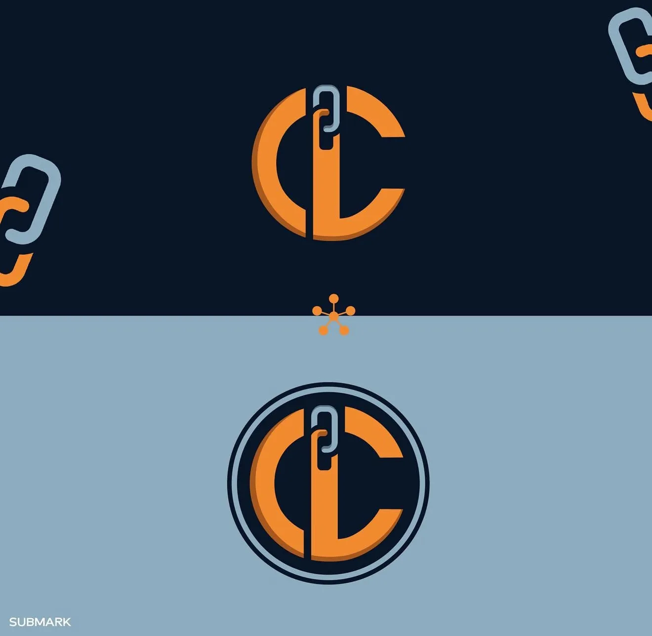
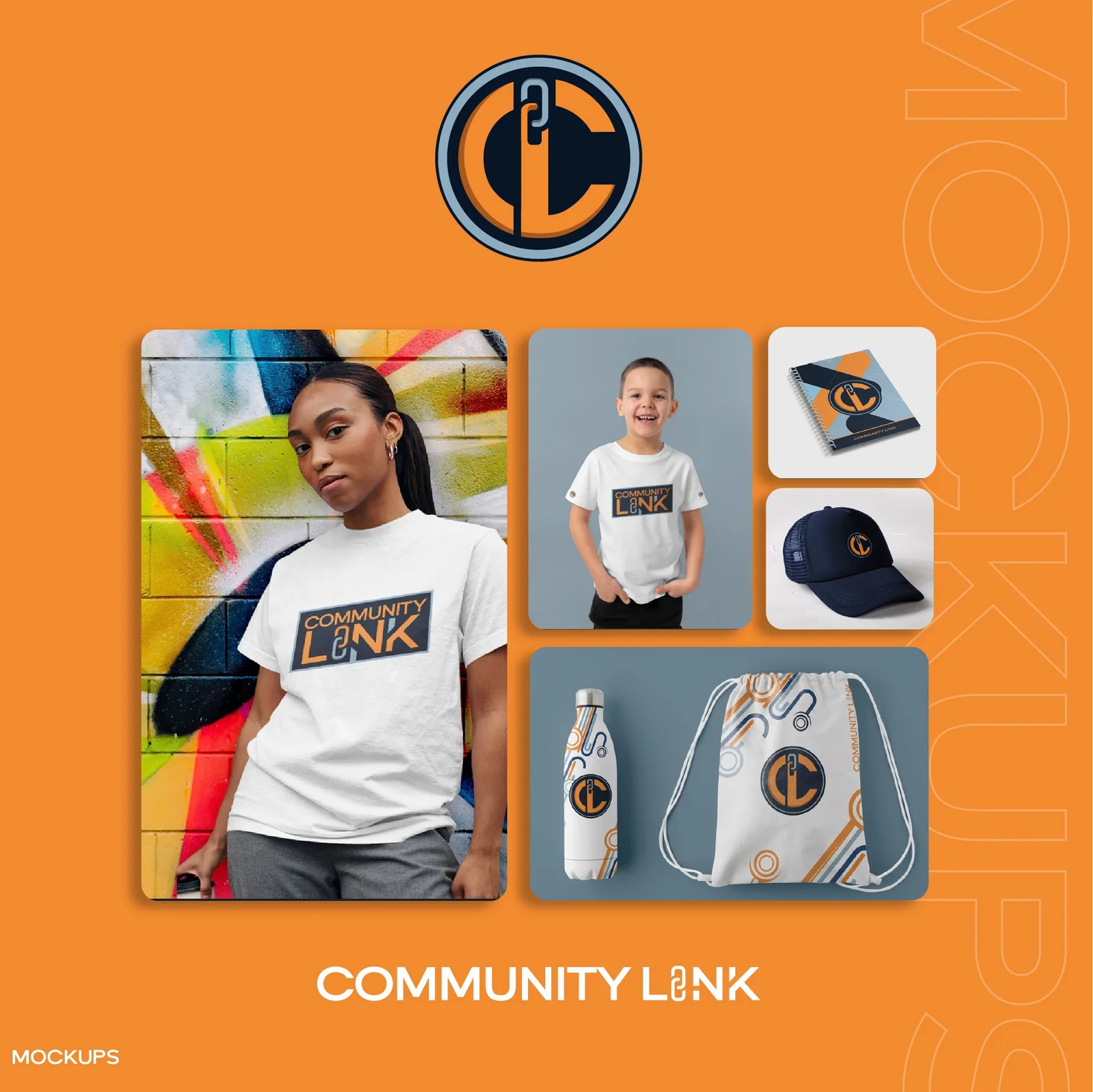
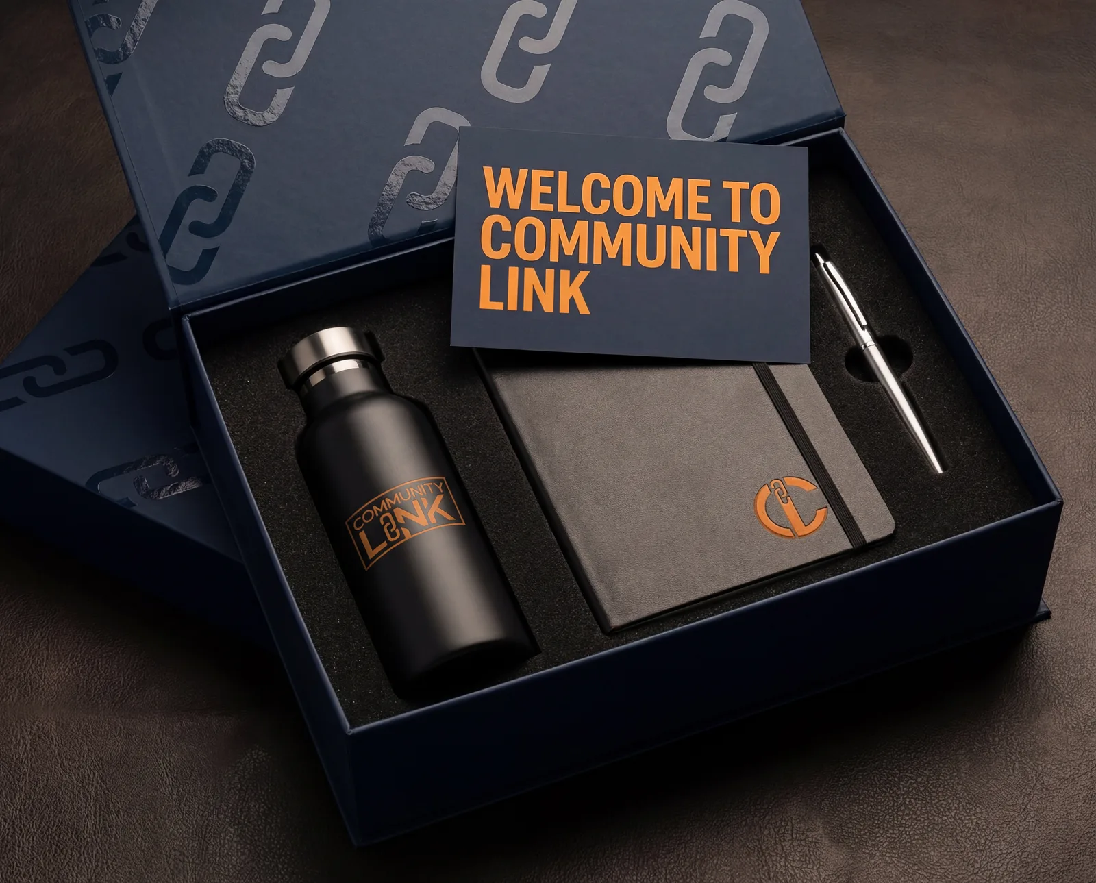
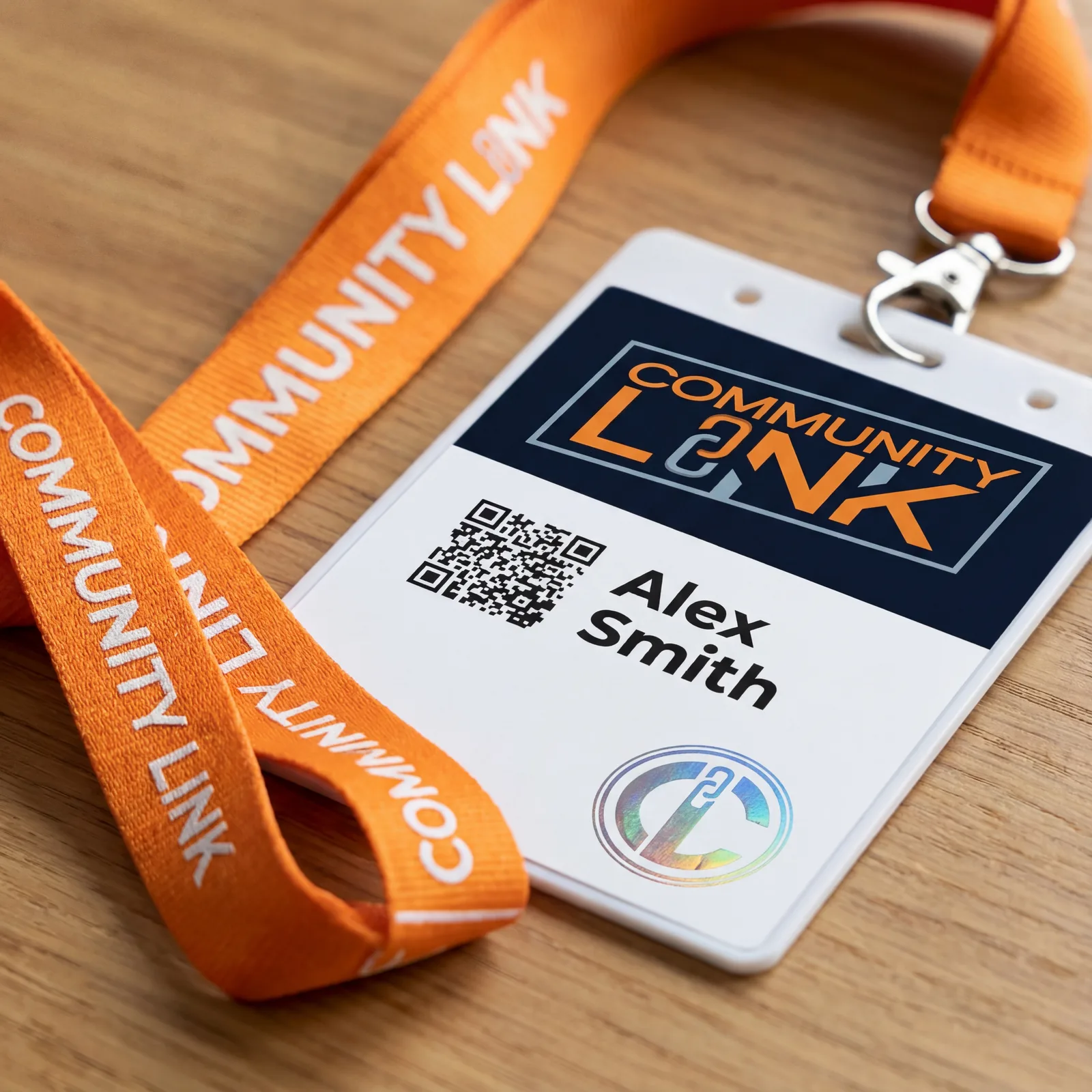
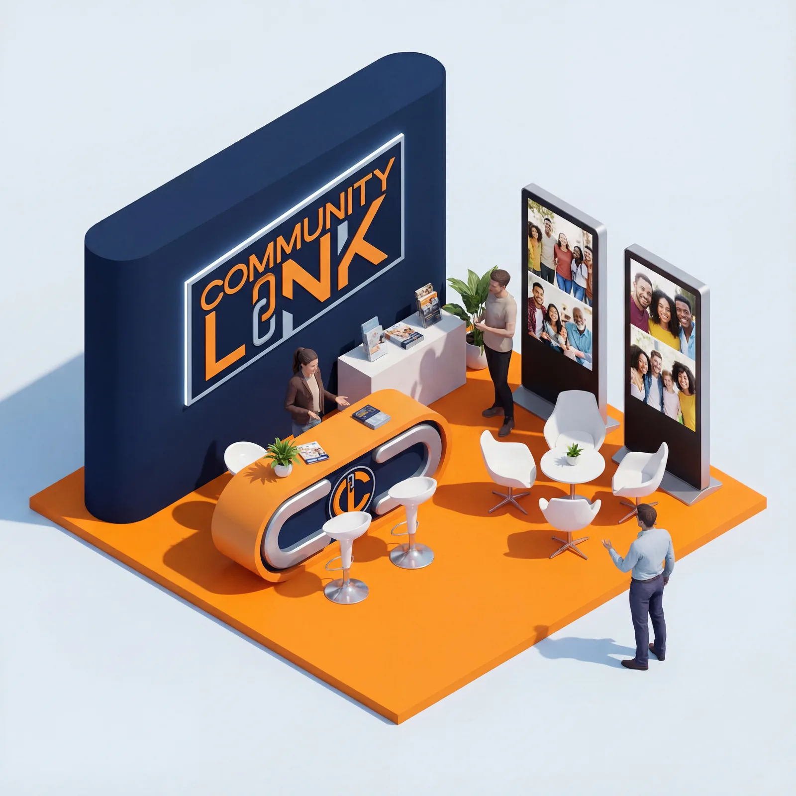
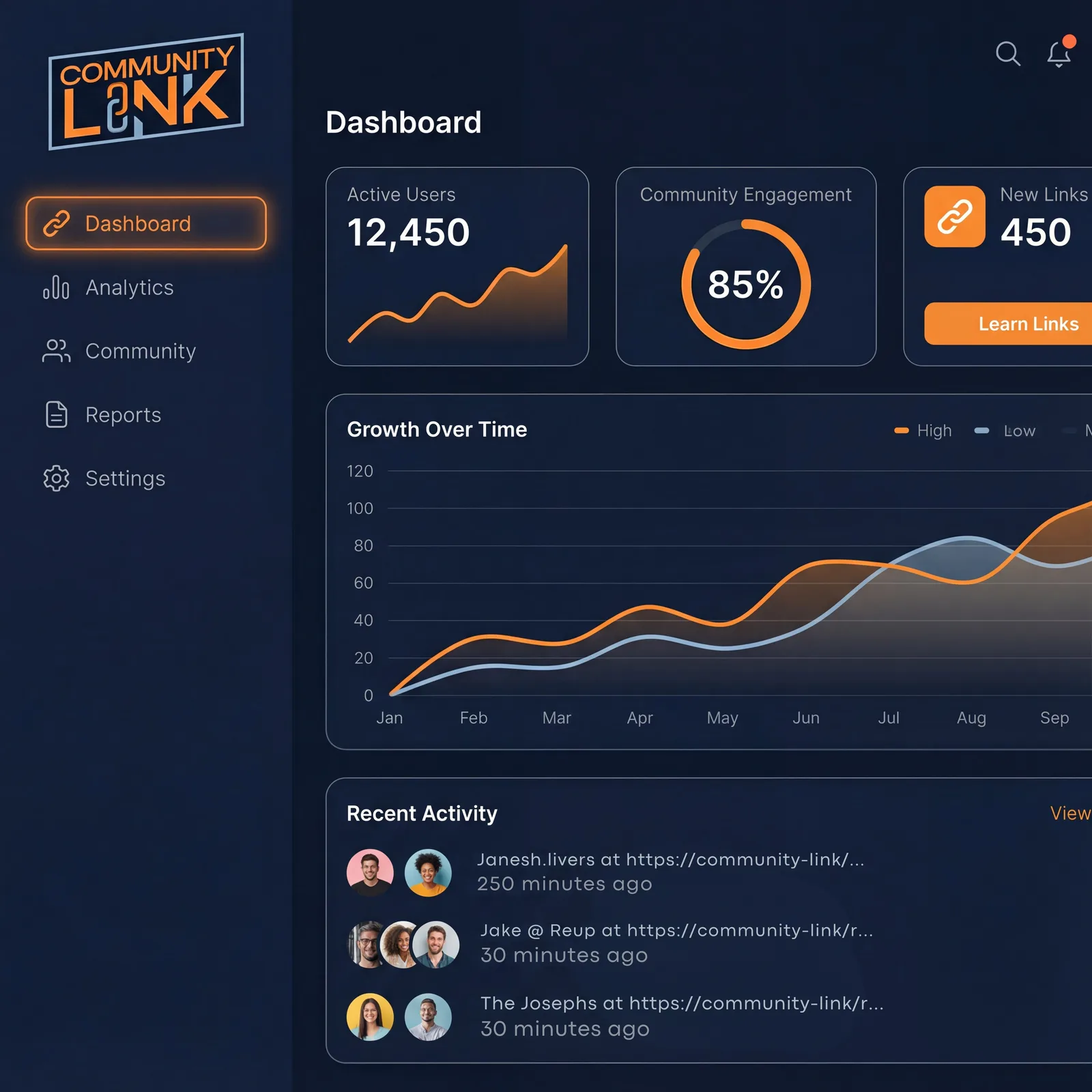
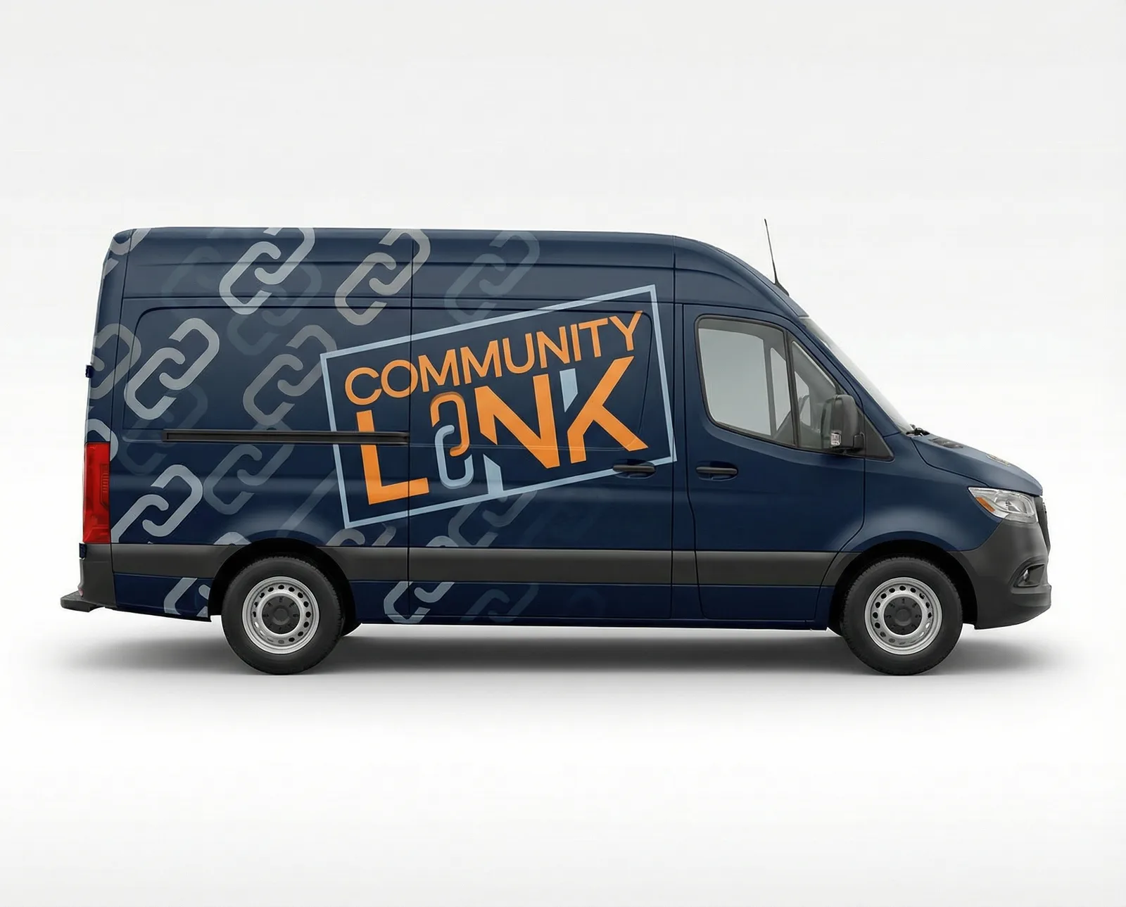
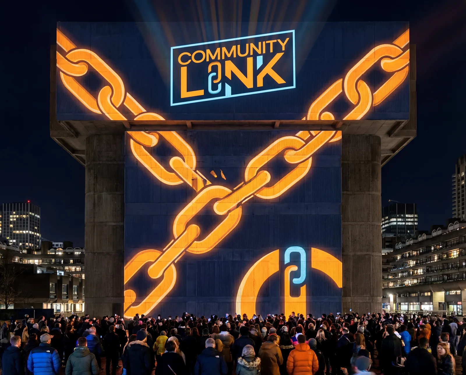
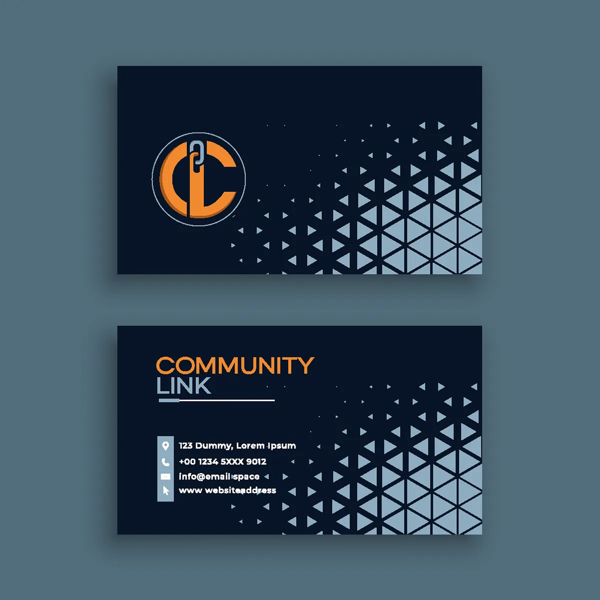
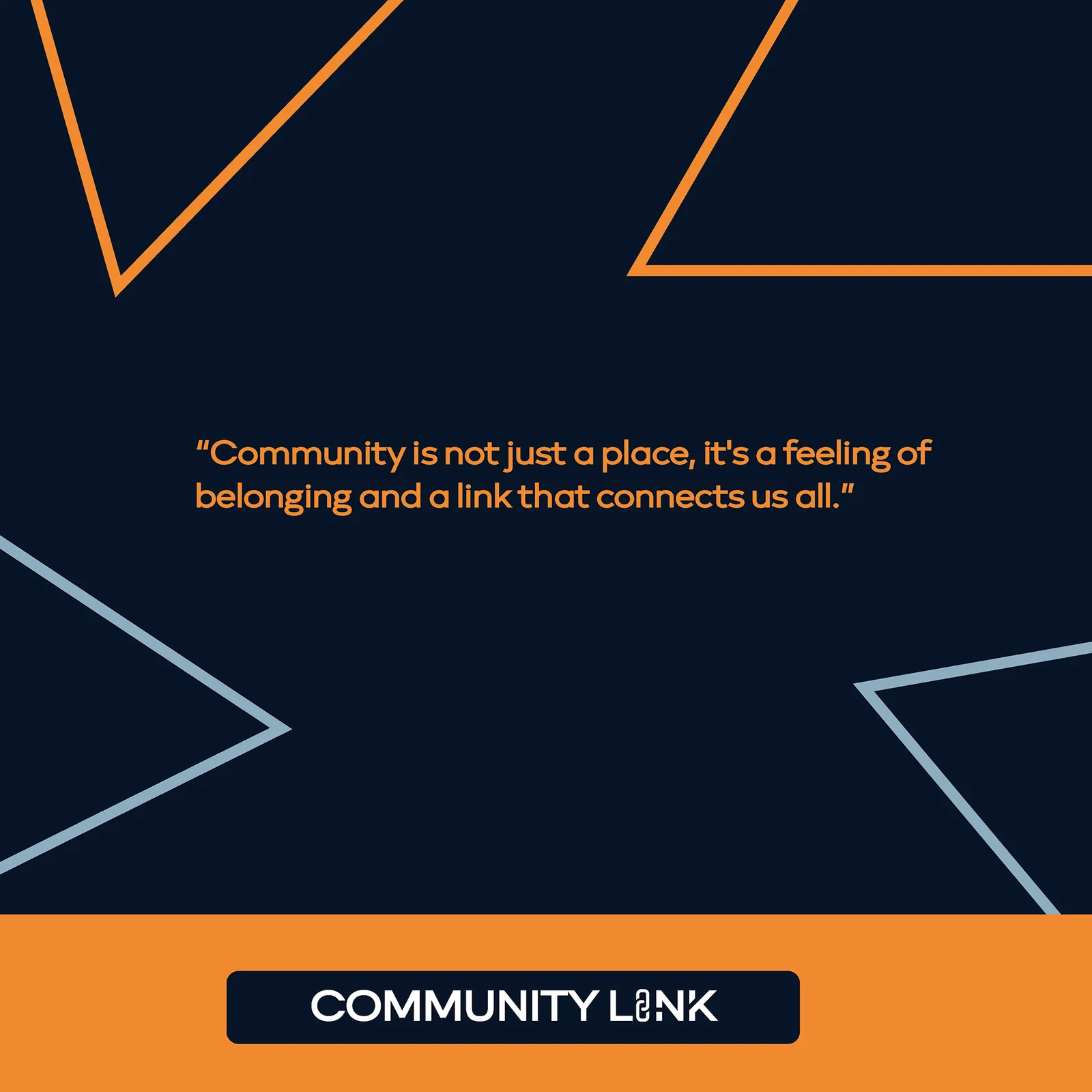
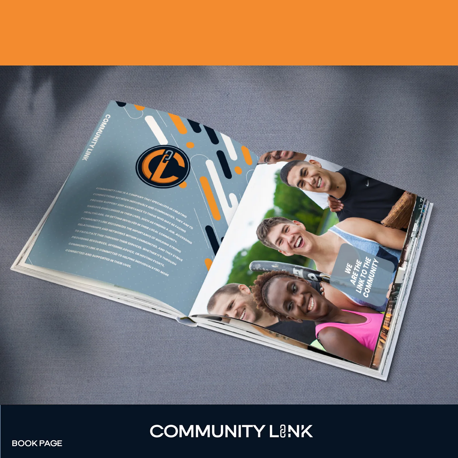
Community Link brand identity fosters cohesion through a chain-inspired logo and energetic palette, ensuring a unified message of connection across all physical and digital touchpoints.
The Challenge
A community organisation has to speak to residents, partners and funders at once, usually through a logo that ends up meaning nothing to any of them.
The Approach
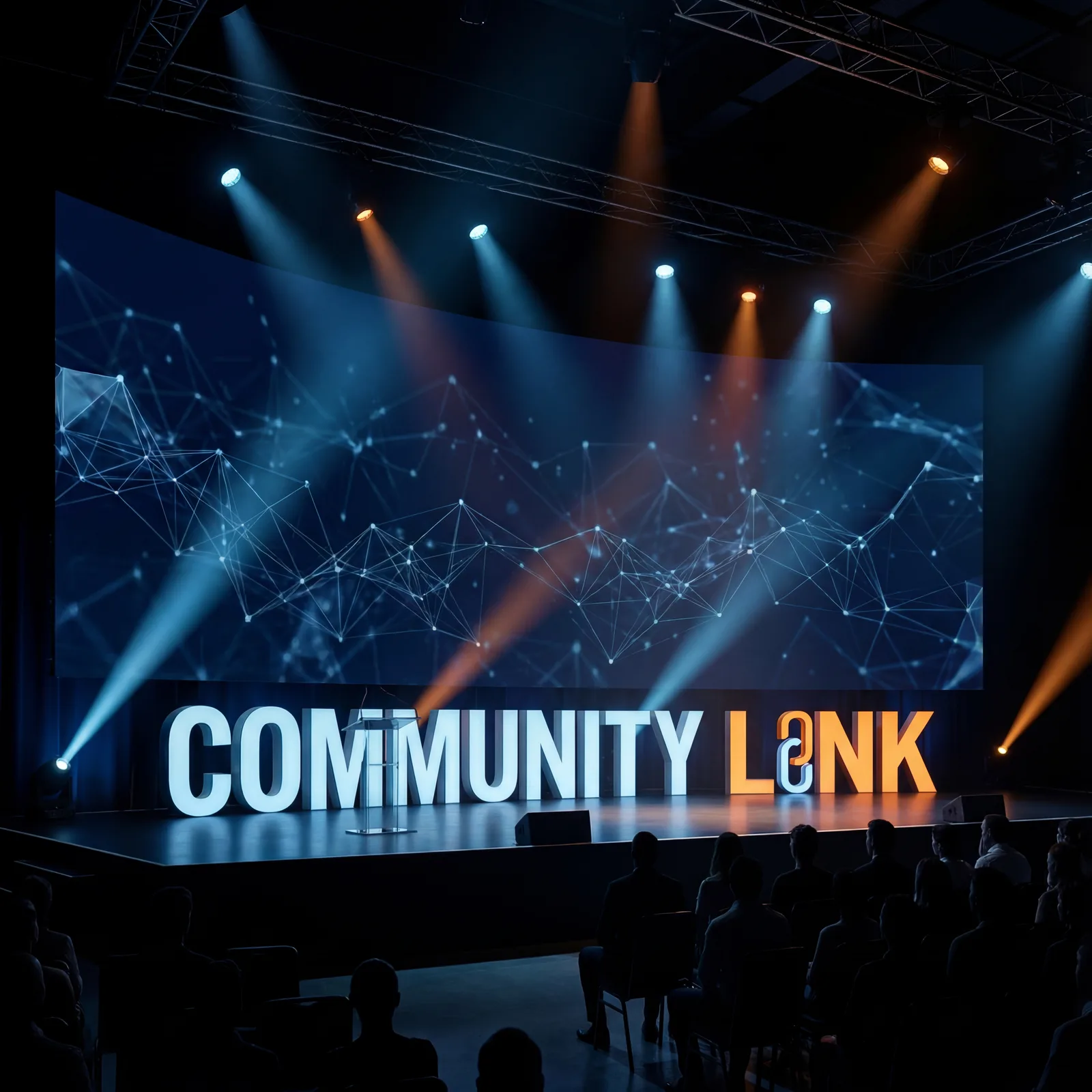
Built the identity on a literal chain link — connection as the entire idea — and paired deep navy with a high-visibility orange so it holds on a stage screen, a polo and a printed brochure alike.
The Result
A system that scales from a business card to a stage backdrop to a member dashboard without losing the point, so every touchpoint says the same thing.