 Back to portfolio
Sugar & Whisk Bakery
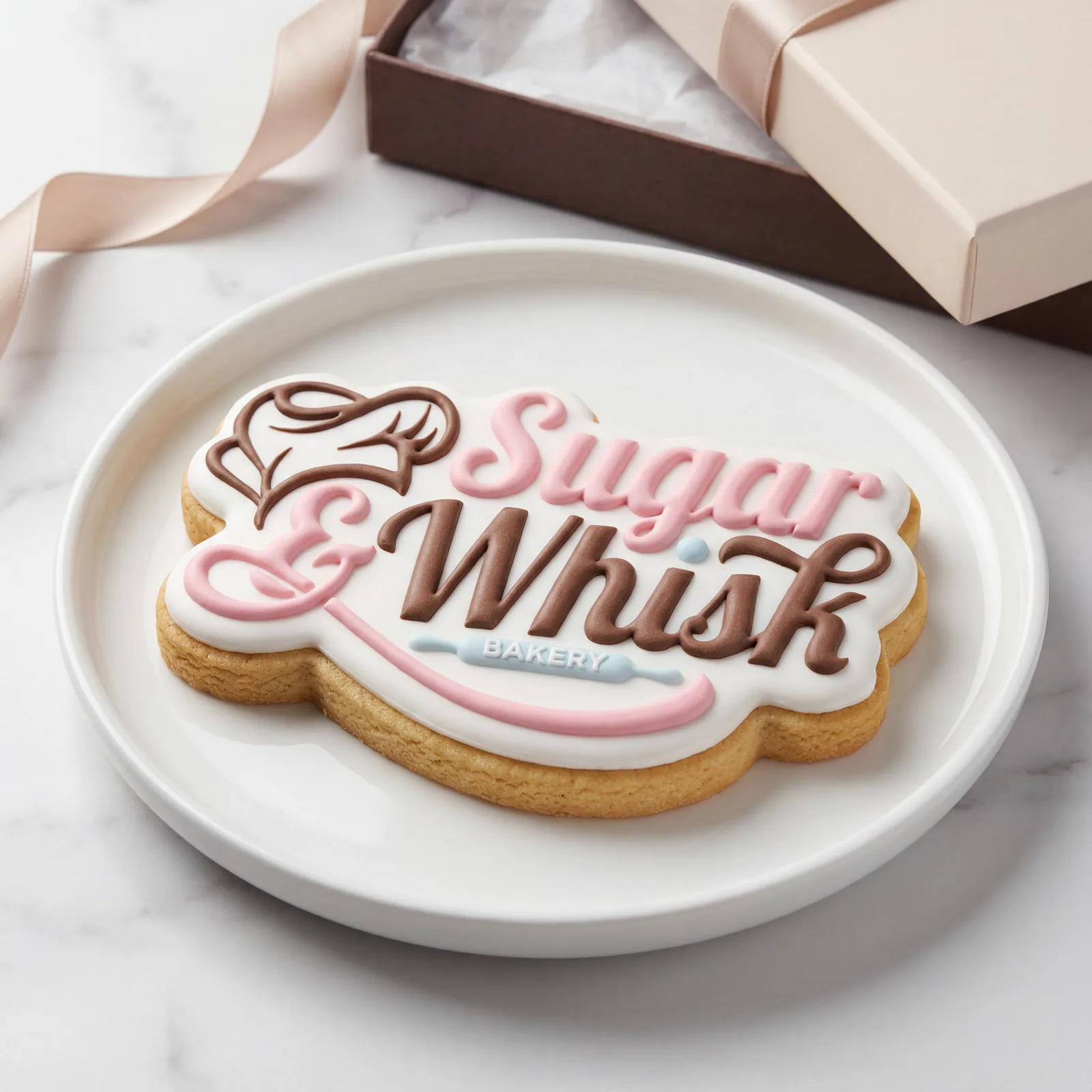
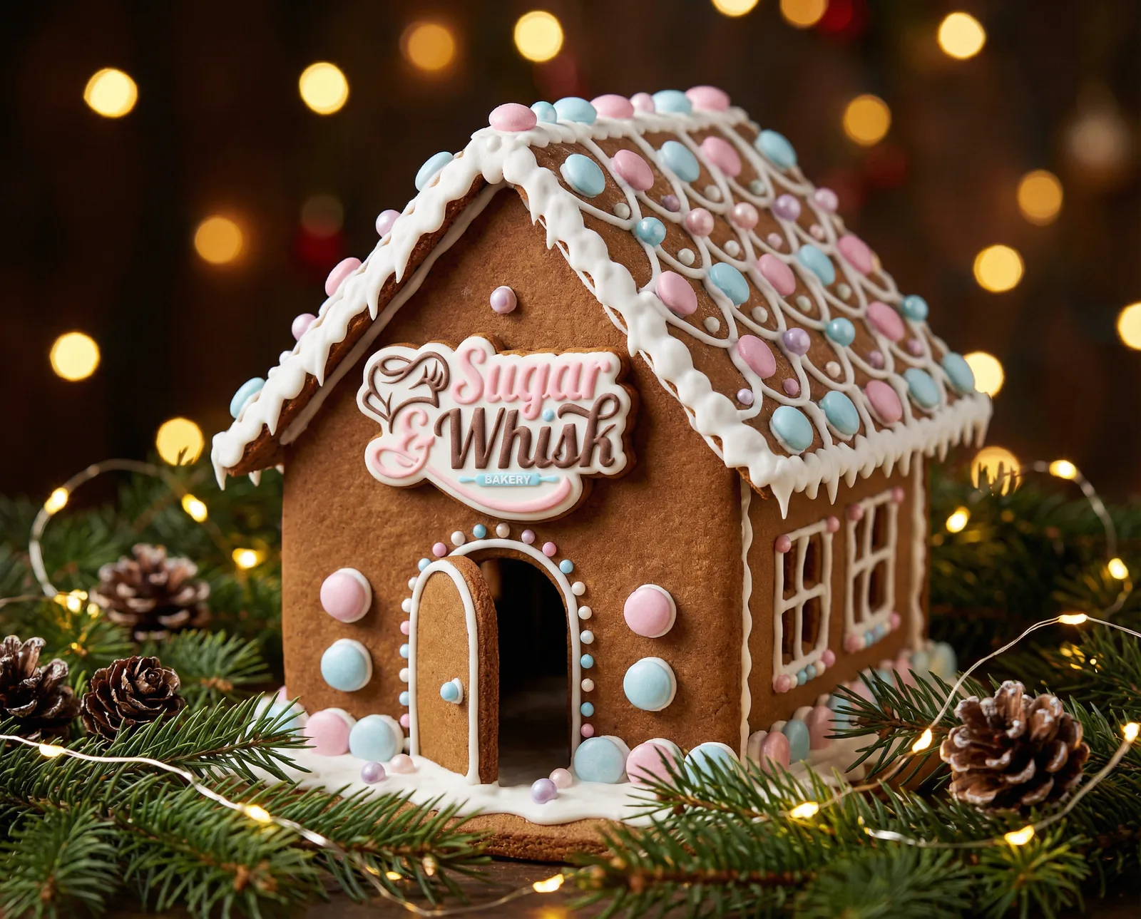
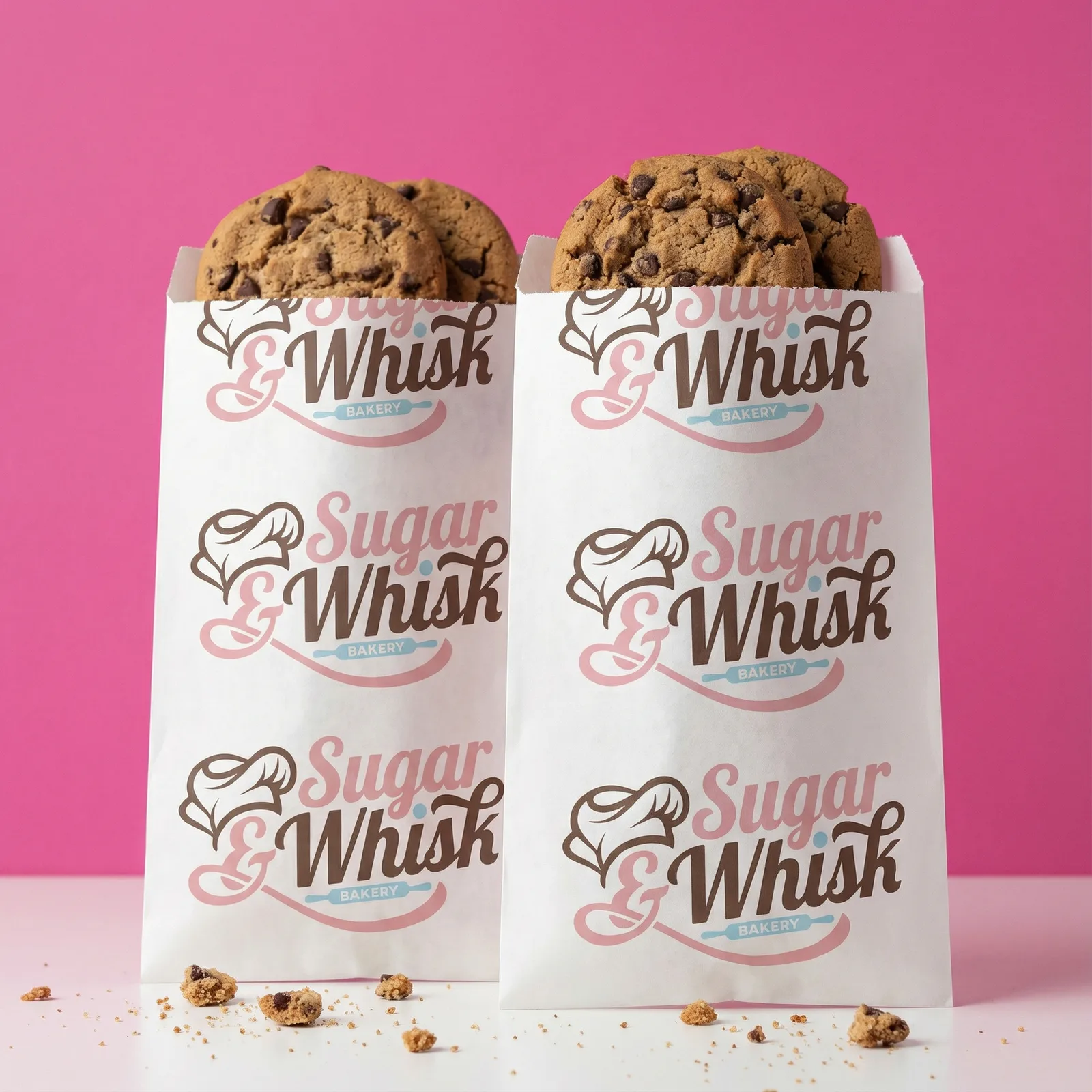
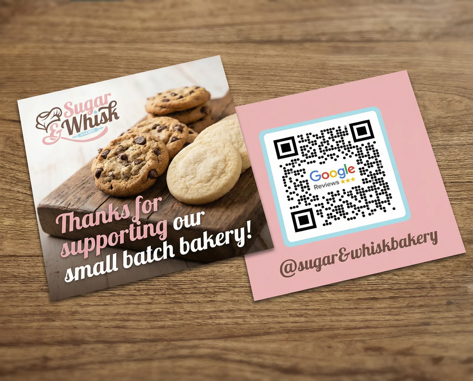
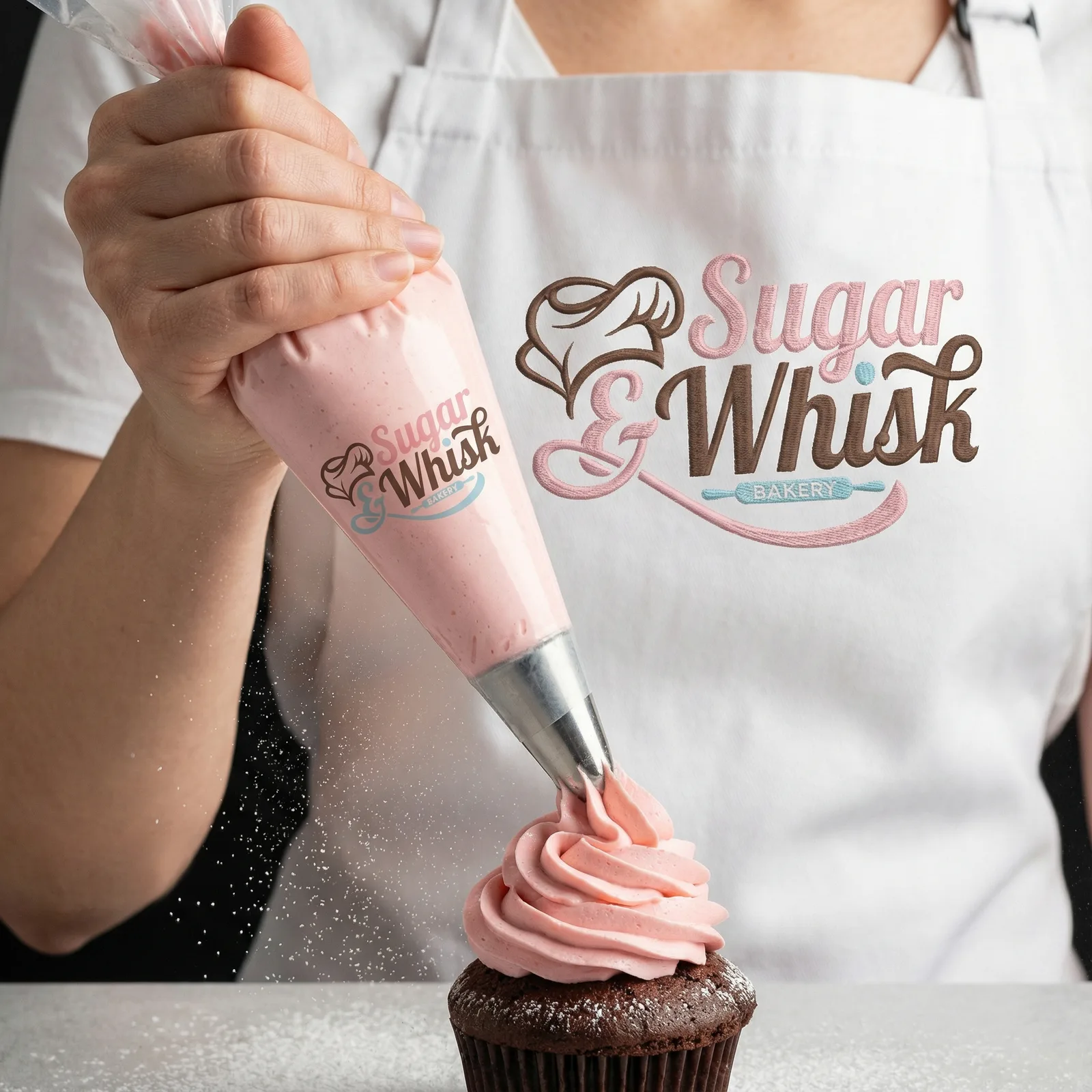
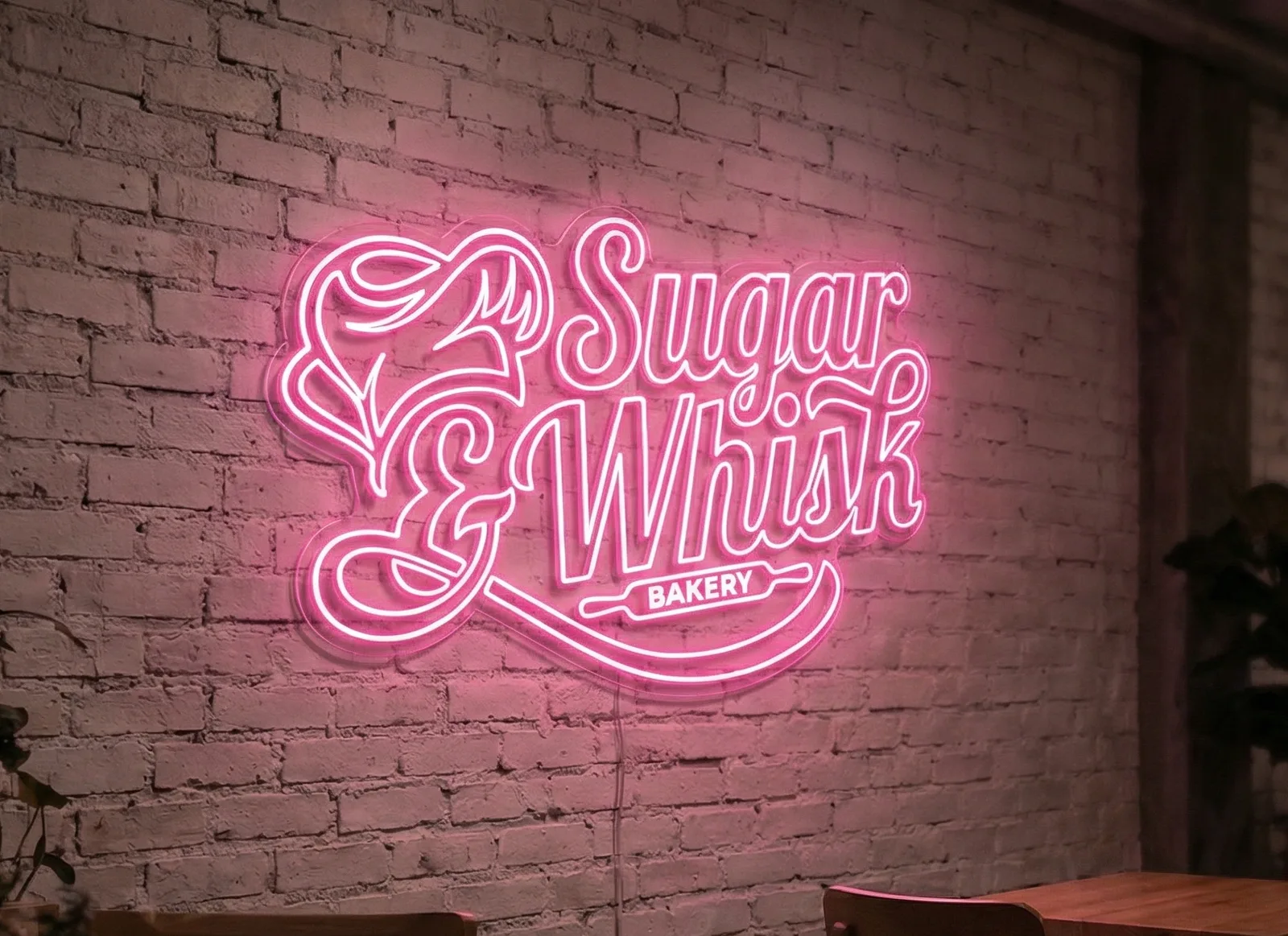
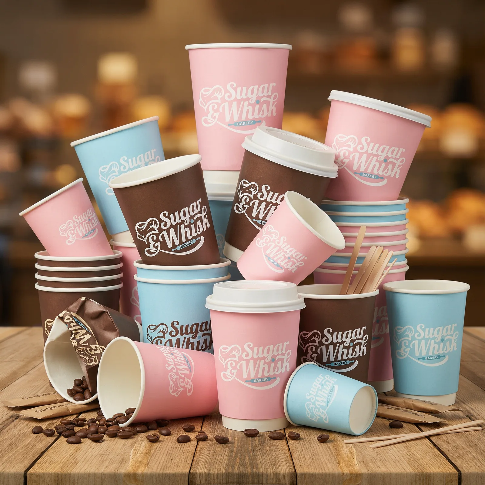
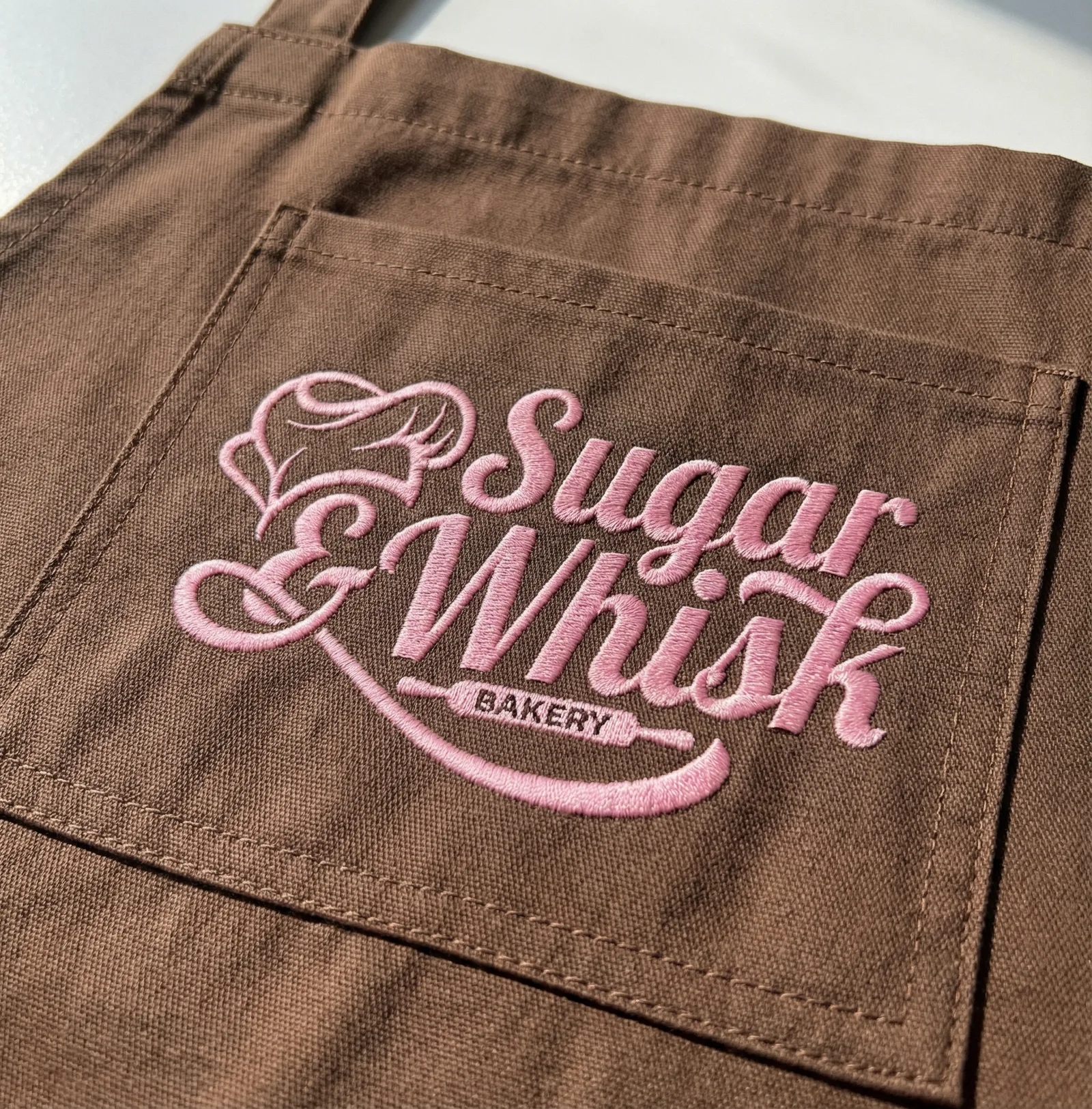
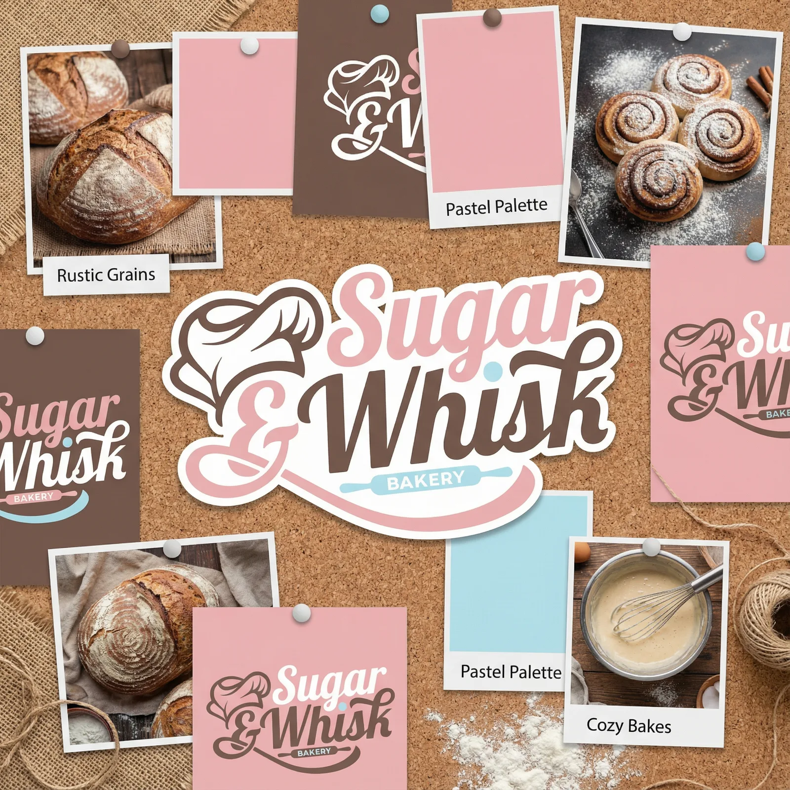
Sugar & Whisk features a charming and playful visual identity centered around a script-based logo that creatively integrates baking iconography like a chef’s hat and rolling pin. The brand utilizes a warm, inviting color palette of chocolate brown, pastel pink, and cream with light blue accents to establish a sweet, artisanal aesthetic.
The Challenge
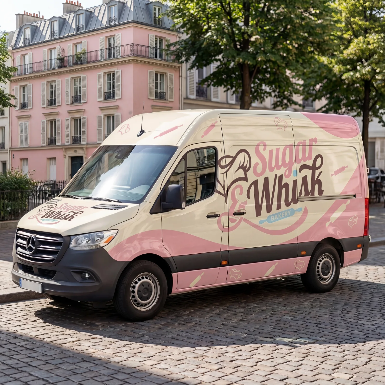
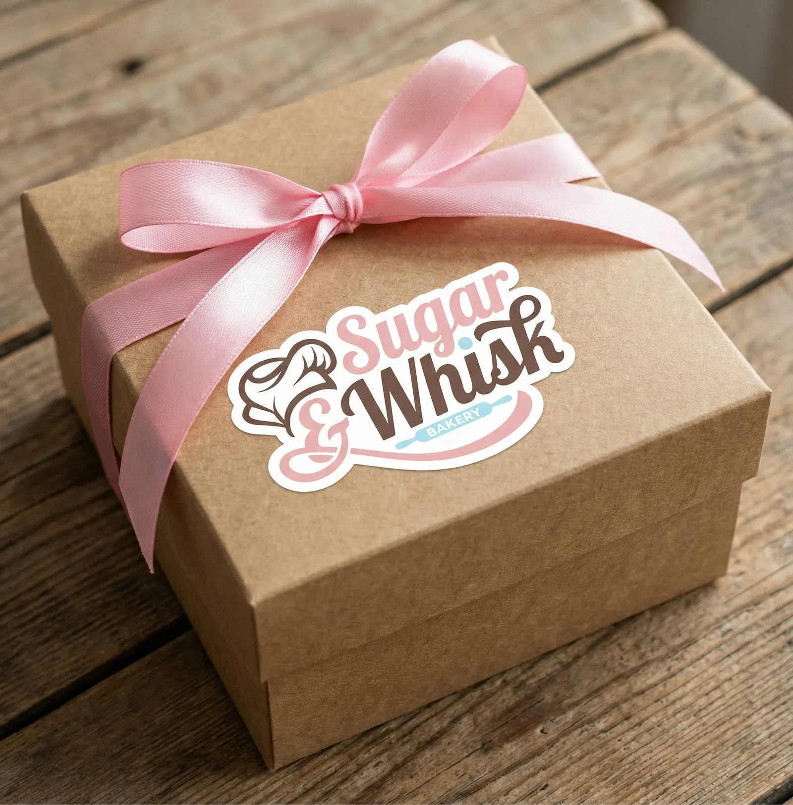
A small-batch bakery has to feel handmade and still hold together across packaging, signage and a shopfront. Charm that does not survive scale is just decoration.
The Approach
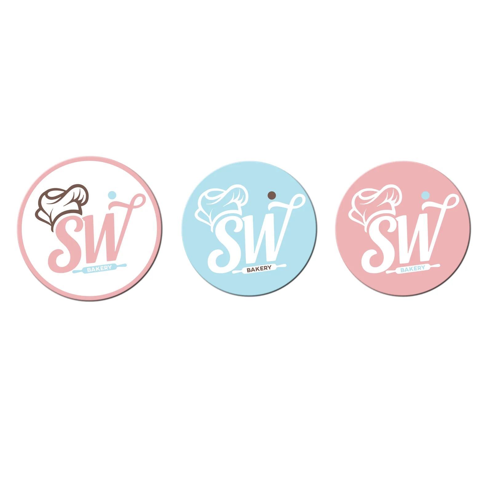
Drew a script lockup that folds the chef's hat and rolling pin into the letterforms, then built a secondary SW badge and a marbled pattern for everywhere the full logo would not fit.
The Result
Chocolate, pastel pink and cream carry from the box to the neon to the apron, with a badge that covers everything from a cookie stamp to a loyalty card.